Instagram filters recreated using CSS3 filter effects
Ever wanted to recreate Instagram filters on the fly using CSS3 (without needing to open a graphics program)? Now you can!
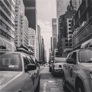
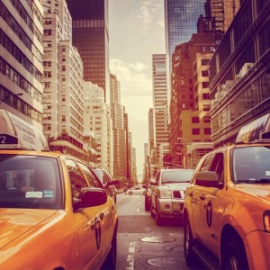
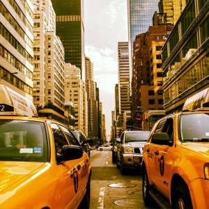
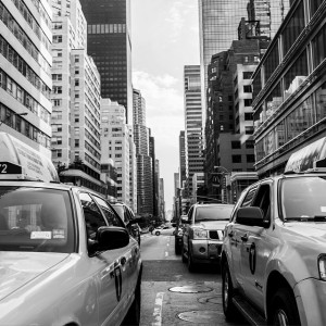
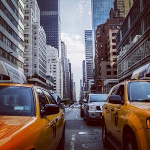
Using the new filters feature in CSS3, you can recreate all of the Instagram filters. I have, with varying levels of success, recreated every Instagram filter. They’re definitely not perfect, but they show how CSS3 can be used to do things that weren’t possible before. The CSS code is included with each filter, so you can use them as is or play around for more accuracy.
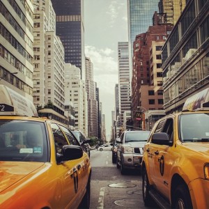
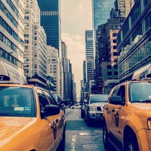
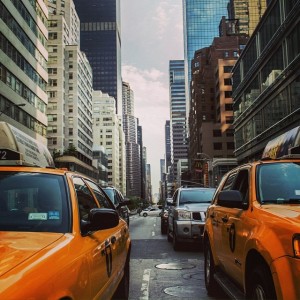
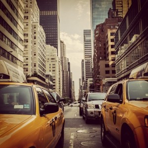
Each filter example includes the original Instagram filter to the left, and the image with CSS3 effect on the right. You can see that if you remove the CSS from the right, you end up with the original, unfiltered image.
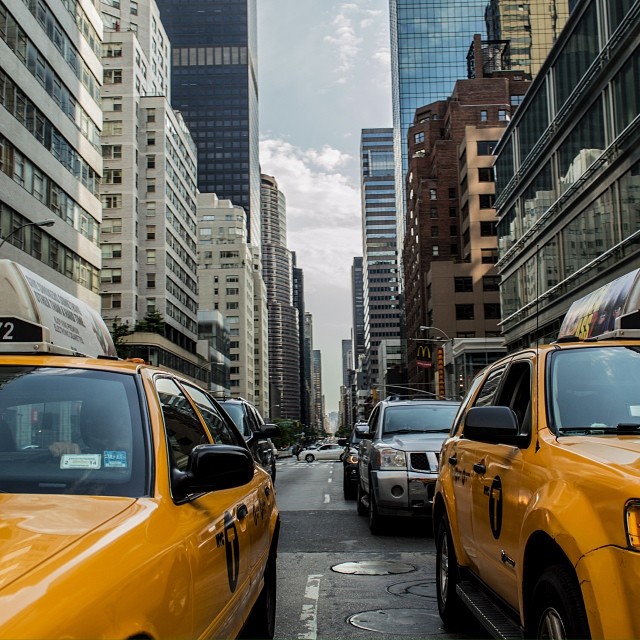
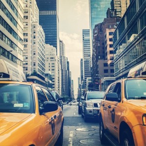
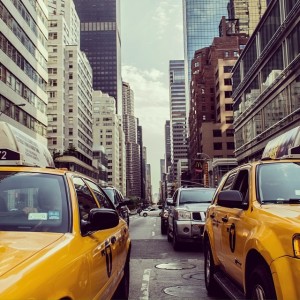
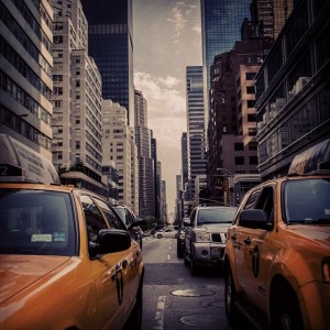
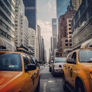
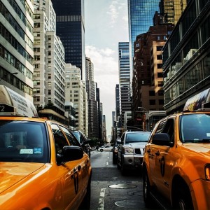
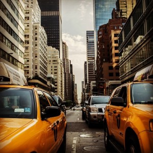
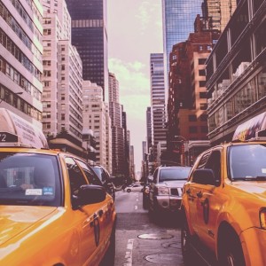
Unfiltered Image
Here is the unfiltered image for your reference:
X-PRO 2
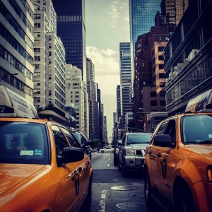
Original Instagram Filter

CSS Filter
.ig-xpro2 {
  -webkit-filter: contrast(1.3) brightness(0.8) sepia(0.3) saturate(1.5) hue-rotate(-20deg);
  filter: contrast(1.3) brightness(0.8) sepia(0.3) saturate(1.5) hue-rotate(-20deg);
}
Willow
Original Instagram Filter
CSS Filter
.ig-willow {
  -webkit-filter: saturate(0.02) contrast(0.85) brightness(1.2) sepia(0.02);
  filter: saturate(0.02) contrast(0.85) brightness(1.2) sepia(0.02);
}
Walden
Original Instagram Filter
CSS Filter
.ig-walden {
  -webkit-filter: sepia(0.35) contrast(0.9) brightness(1.1) hue-rotate(-10deg) saturate(1.5);
  filter: sepia(0.35) contrast(0.9) brightness(1.1) hue-rotate(-10deg) saturate(1.5);
}
Valencia
Original Instagram Filter
CSS Filter
.ig-valencia {
  -webkit-filter: sepia(0.15) saturate(1.5) contrast(0.9);
  filter: sepia(0.15) saturate(1.5) contrast(0.9);
}
Toaster
Original Instagram Filter
CSS Filter
.ig-toaster {
  -webkit-filter:sepia(0.4) saturate(2.5) hue-rotate(-30deg) contrast(0.67);
  -filter:sepia(0.4) saturate(2.5) hue-rotate(-30deg) contrast(0.67);
}
Sutro
Original Instagram Filter
CSS Filter
.ig-sutro {
  -webkit-filter: brightness(0.75) contrast(1.3) sepia(0.5) hue-rotate(-25deg);
  filter: brightness(0.75) contrast(1.3) sepia(0.5) hue-rotate(-25deg);
}
Sierra
Original Instagram Filter
CSS Filter
.ig-sierra {
  -webkit-filter: contrast(0.8) saturate(1.2) sepia(0.15);
  filter: contrast(0.8) saturate(1.2) sepia(0.15);
}
Rise
Original Instagram Filter
CSS Filter
.ig-rise {
  -webkit-filter: saturate(1.4) sepia(0.25) hue-rotate(-15deg) contrast(0.8) brightness(1.1);
  filter: saturate(1.4) sepia(0.25) hue-rotate(-15deg) contrast(0.8) brightness(1.1);
}
Nashville
Original Instagram Filter
CSS Filter
.ig-nashville {
  -webkit-filter: sepia(0.4) saturate(1.5) contrast(0.9) brightness(1.1) hue-rotate(-15deg);
  filter: sepia(0.4) saturate(1.5) contrast(0.9) brightness(1.1) hue-rotate(-15deg);
}
Mayfair
Original Instagram Filter
CSS Filter
.ig-mayfair {
  -webkit-filter: saturate(1.4) contrast(1.1);
  filter: saturate(1.4) contrast(1.1);
}
Lo-Fi
Original Instagram Filter
CSS Filter
.ig-lofi {
  filter: contrast(1.4) brightness(0.9) sepia(0.05);
  -webkit-filter: contrast(1.4) brightness(0.9) sepia(0.05);
}
Kelvin
Original Instagram Filter
CSS Filter
.ig-kelvin {
  filter: sepia(0.4) saturate(2.4) brightness(1.3) contrast(1);
  -webkit-filter: sepia(0.4) saturate(2.4) brightness(1.3) contrast(1);
}
Inkwell
Original Instagram Filter
CSS Filter
.ig-inkwell {
  -webkit-filter: grayscale(1) brightness(1.2) contrast(1.05);
  filter: grayscale(1) brightness(1.2) contrast(1.05);
}
Hudson
Original Instagram Filter
CSS Filter
.ig-hudson {
  -webkit-filter: contrast(1.2) brightness(0.9) hue-rotate(-10deg);
  filter: contrast(1.2) brightness(0.9) hue-rotate(-10deg);
}
Hefe
Original (Instagram) Filter
CSS Filter
.hefe {
  -webkit-filter: contrast(1.3) sepia(0.3) saturate(1.3) hue-rotate(-10deg) brightness(0.95);
  filter: contrast(1.3) sepia(0.3) saturate(1.3) hue-rotate(-10deg) brightness(0.95);
}
Earlybird
Original Instagram Filter
CSS Filter
.ig-earlybird {
  -webkit-filter: sepia(0.4) saturate(1.6) contrast(1.1) brightness(0.9) hue-rotate(-10deg);
  filter: sepia(0.4) saturate(1.6) contrast(1.1) brightness(0.9) hue-rotate(-10deg);
}
Brannan
Original Instagram Filter
CSS Filter
.ig-brannan {
  -webkit-filter: sepia(0.5) contrast(1.4);
  filter: sepia(0.5) contrast(1.4);
}
Amaro
Original Instagram Filter
CSS Filter
.ig-amaro {
  -webkit-filter: hue-rotate(-10deg) contrast(0.9) brightness(1.1) saturate(1.5);
  filter: hue-rotate(-10deg) contrast(0.9) brightness(1.1) saturate(1.5);
}
1977
Original Instagram Filter
CSS Filter
.ig-1977 {
  -webkit-filter: sepia(0.5) hue-rotate(-30deg) saturate(1.2) contrast(0.8);
  filter: sepia(0.5) hue-rotate(-30deg) saturate(1.2) contrast(0.8);
}
See also
- CSS Filter Playground – This shows all of the different filters available in CSS3.
- CSS Background Blend Modes – I didn’t use this method because I didn’t want to resort to using background images, but it shows how you can get some pretty awesome blend effects using CSS3
- CSS Filter Effects – this has a handy slider tool that also generates the CSS on the fly!
- CSS3 Filters Browser Support
Let us know
If you managed to get a better match to the Instagram filters by playing around with the CSS Filters, we would love to know. Please leave a comment and we’ll include a link to you if you provide something useful.