Minimalist and simplified logo redesigns inspired by Patreon’s rebrand
Take a look at these insane (unofficial) logo reinventions of some of the world’s biggest brands. These logo redesigns were inspired by Patreon’s rebrand.
Patreon’s recent rebrand takes the trend of logo simplification to the extreme. Patreon switched out their unique “p” symbol for a rectangle and a circle.

Frustrated with the trend of oversimplification, Reddit user /r/g_noodle took it upon themselves to reimagine other big brand’s logos in a minimalist form. Can you guess which brands each of these logos represent?
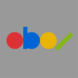
Starting out easy: it’s eBay‘s logo, simplified!

You probably guessed that this logo redesign belongs to Apple. Apple’s logo is already quite simple to begin with.

Starting to get trickier, McDonald’s distinctive golden arches are trashed for some rectangles. I like this one because it looks like fries.
Logo redesign for Twitter. You can see the bird’s head shape with the beak.

This one would actually make a good favicon for Amazon.

Facebook‘s lowercase F is looking a lot more blocky.
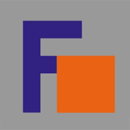
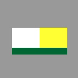
FedEx still clearly identifiable with this minimalist treatment.
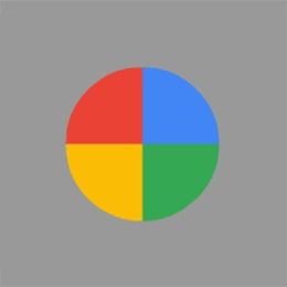
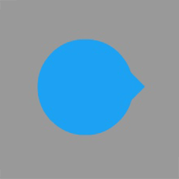
Some of these re-imaginations are clearly better than others. Did you get Google from this circle?
Monster energy drink loses its primal look with these rectangles.

This one is my favourite because it’s ridiculous. Did you guess Nike?
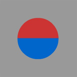
Pepsi‘s logo didn’t need that much of a change to arrive at this circle logo.

This one is meant to be Spotify.
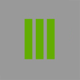
Subway. Eat rectangles.

I didn’t guess this one. Did you get YouTube?

Finally, this one was difficult to guess. Firefox!
That was fun. One must wonder which brand will be next to get the terrible rebranding treatment. How many logos did you manage to guess?